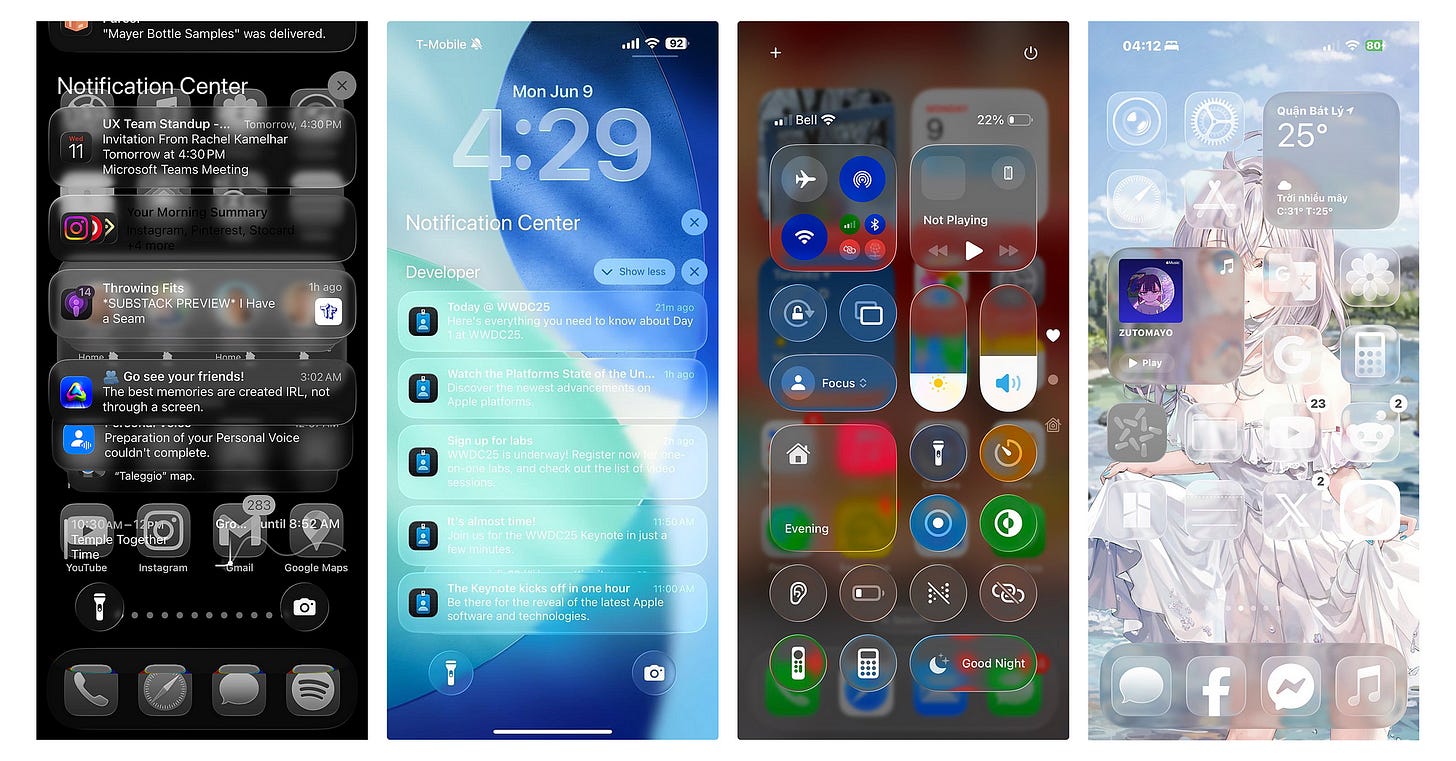
Apple's new Liquid Glass is its broadest design update yet. Is it genius design or overrated?
A critical eye on Apple’s macOS Tahoe redesign, along with critical memes
In today’s UXBeginner newsletter, we’re going to focus just on the huge new design update from Apple, which will undoubtedly have ripple effects across the industry and affect how designers approach their work.
Upgrade your design skills at a lower cost: check out these discount links for Springboard and Interaction Design Foundation!
Liquid Glass and the return of tangible pixels
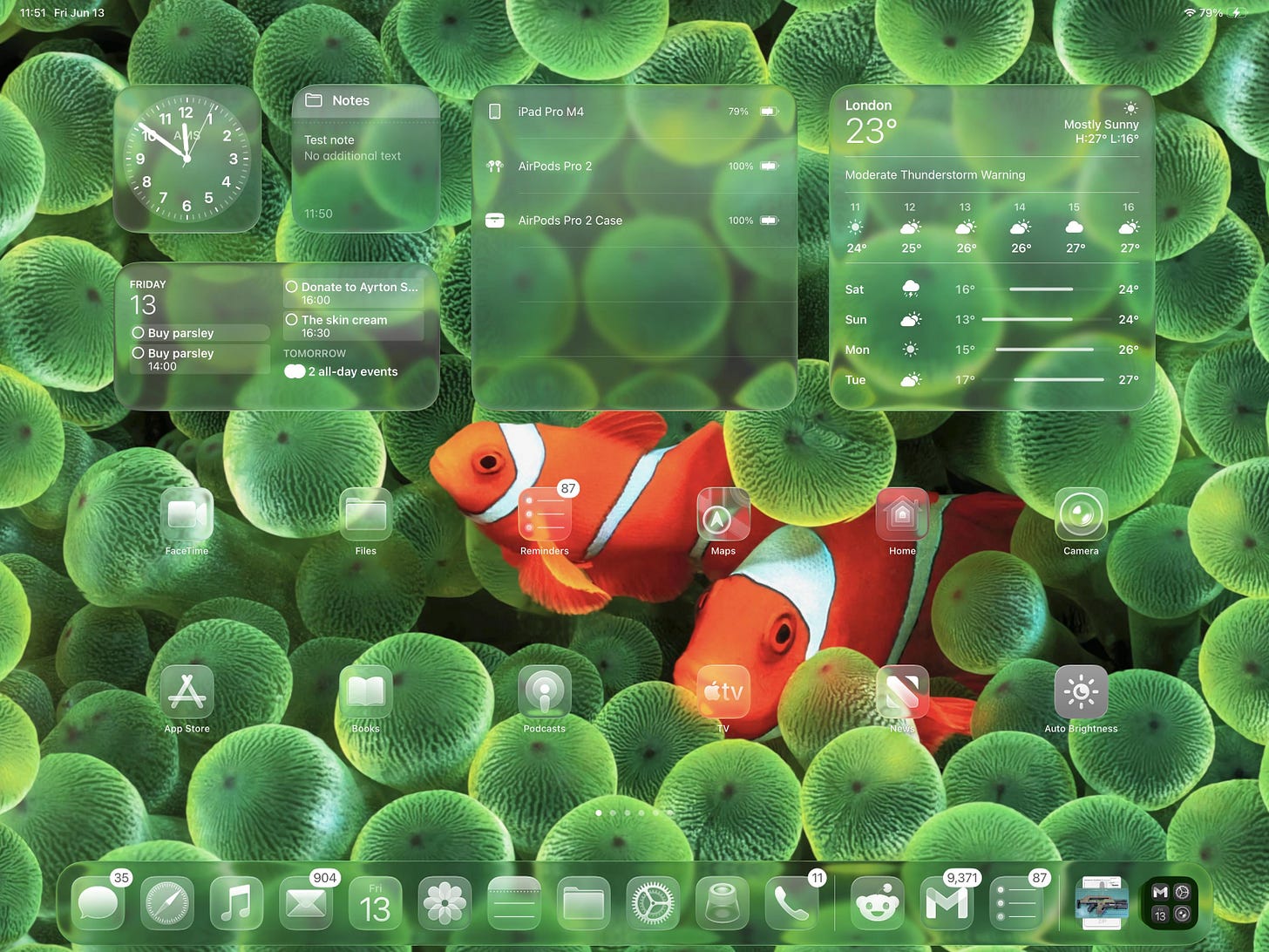
Apple’s WWDC-25 keynote didn’t open with an AI arms race flex. Instead, it quietly upended an era of flat UI by revealing Liquid Glass, a new design language debuting in macOS Tahoe 26 (Apple newsroom).
At first glance it looks like translucent eye candy. But under the glossy sheen sits Apple’s bigger bet: reshaping how we perceive digital objects so our brains are ready for interfaces that feel physical, reactive, and native to whatever space we’re in.
What exactly is Liquid Glass and where did it come from?
Liquid Glass UI is…
translucent and behaves like glass in the real world, transforming depending on the user’s context or content. Its color is informed by surrounding content and intelligently adapts between light and dark environments.
But this isn’t just an arbitrary, shiny new update.
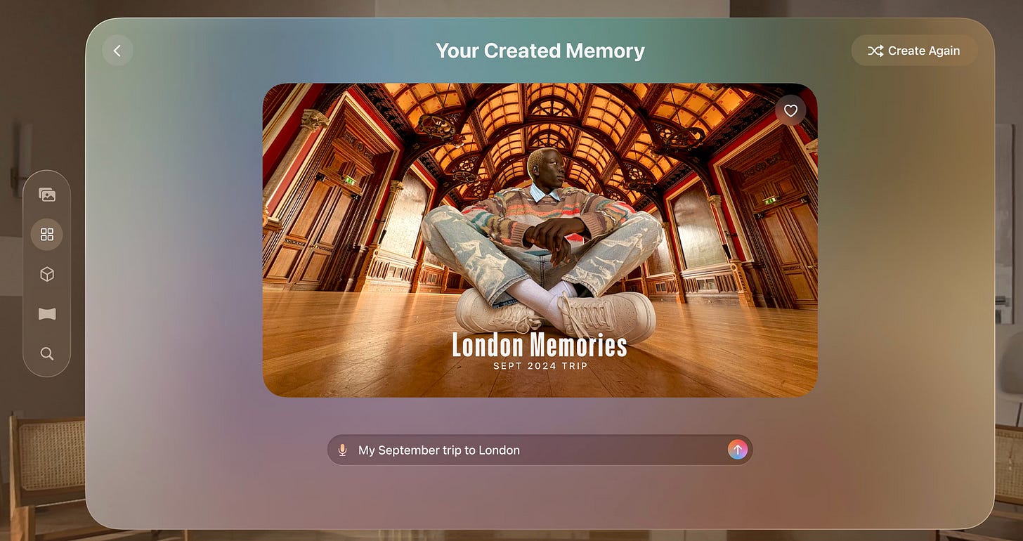
Apple’s visionOS has introduced this style of UI since been operating the Apple Vision Pro launched in February 2024.
In spatial computing, the user interface needs to be aware of the user’s surroundings in 3D space. Allowing light to pass through the background can provide seamless immersion within virtual reality, rather than just force feeding a desktop UI onto your eyeballs.
Now Liquid Glass is going to be Apple’s broadest design update yet, that’ll first debut in macOS Tahoe 26 and roll out across iOS 26, iPadOS 26, watchOS 12 and tvOS 20.
But why apply this across the board?
RELEVANT SPONSORThe fundamentals of visual design will help you usable craft interfaces, no matter what the latest OS or design trend is. Check out Interaction Design’s Ultimate Guide to Visual Design :
Bonus: get 3 months free to IxD’s learning plans using my Educational Partner link.
My 3 guesses as to why Liquid Glass is going everywhere
I’m going to provide you my reasons leading up to the most technical one…
It’s fun and fresh. Apple is going to maintain its design leadership by staying ahead of the curve with fresh look and new updates. Kind of the same reason any company would do a redesign.
They’re prepping us for a new spatial era: Apple is a platform computing company with multiple devices like iPhone, iPad, Apple Watch, AirPods, Macbook, VisionOS…this move might be a practical foundations of prepping their ecosystem to be even more seamless cross-platform.
After all, it’s in Apple’s best interest that all their products work seamlessly together so that you buy ALL of them…including future products. Maybe a cheaper version of Apple Vision next?
There are some cognitive science benefits. Liquid Glass leans on research showing environment-responsive visuals lower mental parsing time.
A 2024 paper from Skulmowski showed that simplified depth cues (i.e., environment-responsive shading) “elicited significantly lower subjective cognitive-load.”
So there’s evidence that environment-responsive visual cues, which abound in Liquid Glass, reduce mental parsing effort.
But it won’t be perfect. People are already complaining about accessibility.
Fun internet reactions about Liquid Glass
It’s almost customary that memes and jokes will abound when any major player launches a big redesign. Let’s go through the list…
We must not forget Windows Vista
Windows reacted with an homage to Windows Vista with a not-so-subtle “it’s already been done” clapback on Instagram:
FWIW, my experience of Vista was SUPER buggy and I just downgraded to MS 2000.
This Reddit thread was rife with comments on how commented on how Liquid Glass negatively affects contrast and accessibility, with comments like…
u/Purple10tacle
“They managed to both significantly impact contrast and legibility while also removing all color information from the icons - that's some big sacrifices for something that looks like a 15-year-old "inspired by Vista and OSX" KDE theme.”
Just check out one Redditor’s post of his MacOS preview using a Liquid Glass theme 🤣
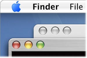
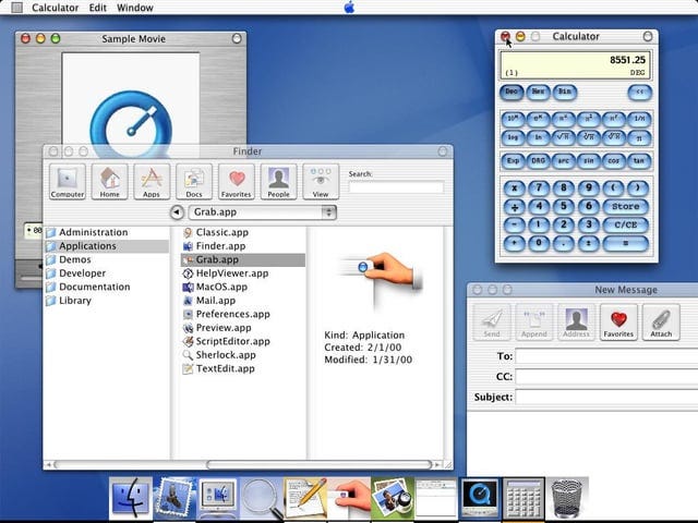
And there will always be the bring-back-skeuomorphism crowd nostalgic for UI of a bygone era, with users missing Leopard, pinstripes, and the Aqua interface of the early 2000s:
Maybe Liquid Glass is just the new Aqua.
Industry heavyweight perspectives
NN/g’s split verdict: Jakob Nielsen’s LinkedIn post flags potential contrast pitfalls.
this new UI technique…really does seem to degrade readability and add visual confusion without any benefits other than looking cool the first time (or even second time, probably) you see it.
I like Mark Sloan’s nuanced comment under Nielsen:
I think part of the problem is how much they seem to rely on their extensive accessibility features. They may feel they can create designs that don't work for many users because people can simply 'turn it off' or 'enable high contrast mode'. But beyond that, I do worry when I see animations that are distracting instead of informative and helpful. The good news is that if they can achieve these effects without impacting battery life, they've optimized new capabilities that could unlock better experiences.
UXDesign.cc deep dive
Michal Langmajer argues Liquid Glass “breaks Apple’s own heuristics” by masking hierarchy and violating predictability.
Hidden interactions: the new UI “increasingly relies on gestures and invisible interactions with no visual hint”
Lack of clarity: Apple decided to start removing labels from icons.
Accessibility and contrast: Text contrast often suffers over blurred or moving backgrounds, making it harder to read, locate active UI elements, or even understand where to tap — especially in bright environments.
My soft verdict + takeaways for designers
I help my mom use her iPhone all the time. I can already tell that this update is going to make life even harder for those who are less tech savvy.
So I worry about basic navigating, wayfinding, and accessibility with this new update.
With that said…I’m kinda excited.
In UX, it’s easy to become absolutist and elitist about design philosophy, which I think led to the flat, minimalist, and boring UI that we’ve seen rule the last decade.
Meanwhile, Liquid Glass feels imperfect, but a setup to a futuristic UI that belongs in 2025.
Apple has clearly invested a ton into this new redesign.
And sunk cost fallacy will dictate that Apple won’t just abandon ship due to the spicy memes criticizing Liquid Glass, but they’ll make updates over time.
Sometimes, new interfaces make the way—or foreshadow—for new devices and interactions that are hard to anticipate.
Voice UI and chatting with AIs arguable make invisible UI more relevant.
Perhaps Liquid Glass is Apple’s signal that interfaces are entering their “spatial adolescence.”
The leap from skeuomorphic to flat taught us minimalism.
The leap from flat to responsive material will teach us location-aware, light-aware, gaze-aware design.
But the transition won’t be liquidy-smooth.
And the beauty of the software industry is that design can be updated and end-users (like we designers) can make an impact, whether with thoughtful write ups or spicy memes dunking on new designs 🤣
Lets hear your opinion…
Do the Vista memes have a point, or is this genuinely new?
Where could Liquid Glass hurt accessibility in your product?
What’s the first tiny experiment you’ll run with Apple’s new UI?
👇 Hit Leave a comment below — the best takes get featured in next week’s UX digest.
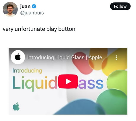
By the way, Apple had to change it’s launch thumbnail, LOL. Took me a second to see it 🍑
SEE YOU NEXT WEEK!Will you help me reach more design-minded folks by sharing or restacking this post? Huge thanks!
Stay curious, designer!
Written by , who also writes Money for Humans.


